
Living Nature, the certified natural skin care and cosmetics brand from New Zealand, has launched a new brand image across its face and body care range with the introduction of attractive box designs using new imagery and introducing colour for the first time.
The result of extensive consultation with retailers and customers, Living Nature’s new packaging is designed to create a powerful visual brand identity, make an eye-catching in-store display, help simplify selection of products by skin type and make it easier for customers to shop.
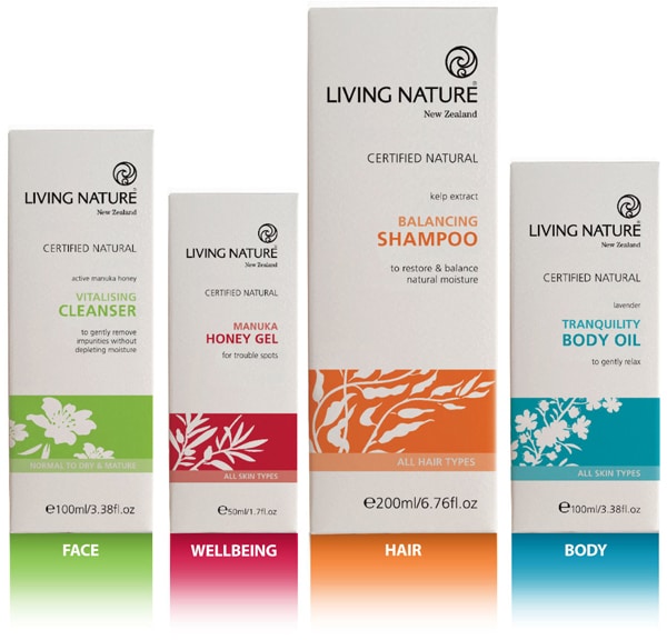
Celebrating its 25th anniversary this year, Living Nature says the time is right to “introduce its true colours” with bands of green for face, blue for body, red for wellbeing and orange for hair. Harnessing the potent skin-beneficial properties of some of New Zealand’s unique botanicals, the new packaging imagery takes inspiration from Living Nature’s botanical ‘Hero’ ingredients, such as Active Manuka Honey, Manuka Oil, Kumerahou and Harakeke, with the bold nature-inspired colours clearly identifying each category in the range
Using only 100% natural preservatives, fragrances and ingredients, Living Nature emphasises its certified natural status, which is now featured prominently on the front of each box, together with clear communications regarding the product’s purpose and benefits (the brand carried the BDIH mark, and is also certified under Whole Foods Market’s Premium Body Care scheme). QR codes are now also displayed on new packs, enabling shoppers with smart phones to scan and link directly to the Living Nature website for additional product information.


