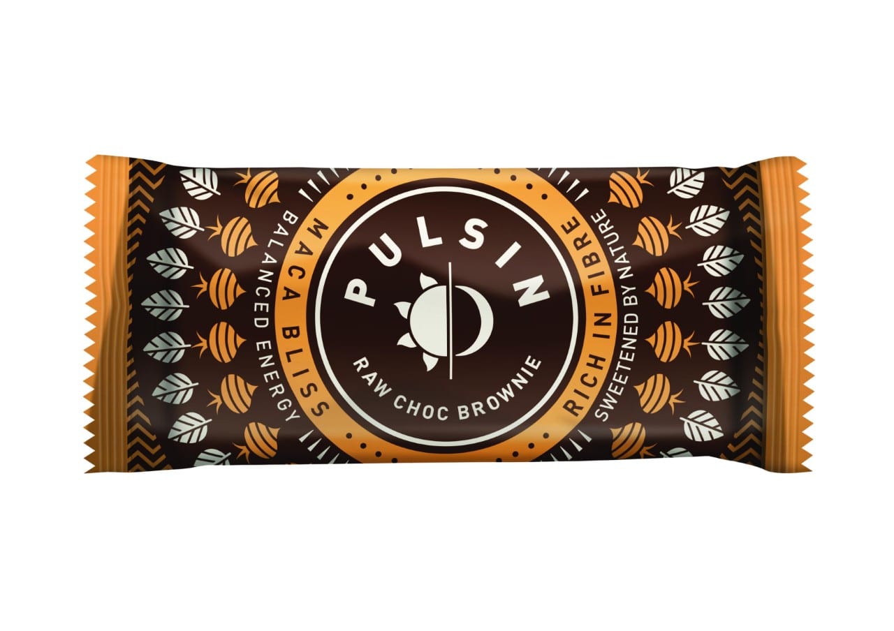
Natural snack and protein powder brand Pulsin is celebrating its tenth birthday by unveiling a striking new look following a major rebrand investment.
The overhaul, undertaken by brand consultancy The Space Creative, includes a new logo as well as refreshed packaging and point of sale material.
The new logo features a sun and moon, representing the idea of sustained, natural energy throughout the day and night and the new packaging incorporates intricate geometric designs with vibrant colours.
“This rebrand is one of the most significant developments we’ve done as a company, and we’re excited to be able to finally share it with our trade partners after substantial investment,” says Pulsin marketing manager Steff Parker. “Consumers are faced with more choice than ever when it comes to healthy snacking, but they often don’t have the time or the energy to read label after label to see if what’s on offer is a healthy as it claims to be, as it often isn’t.
“With this major change to our brand, we feel the logo and packaging now fully reflect what Pulsin is all about – providing people with quality, balanced energy 24/7 to help get them through their days.”
“Pulsin’s products deliver sustained, balanced energy throughout the day and contain only natural ingredients and sugars avoiding the usual sugar highs and lows common with many other products in the sector,” adds David Thomson, creative director of The Space Creative. “So we distilled Pulsin’s essence down to a single phrase: ‘Embrace the Natural Rhythm of Life’.”
As part of the launch, Pulsin will take over a window of Whole Foods’ flagship store on Kensington High Street in May.
The new look will be showcased at Natural & Organic Products Europe in April at London’s ExCeL.


