

Welsh organic dairy brand Rachel’s Organic has refreshed its brand, unveiling a new packaging design across its full range of yogurts and rice puddings.
Retaining the signature black and white colour palette, the redesigned packaging displays a more crafted look and feel that aims to reinforce Rachel’s natural, organic credentials and emphasize its heritage. Building on this, the brand logo will reintroduce the word ‘Organic’, and the motto ‘Faithful to nature since 1952’ will appear on-pack.
“We’re delighted to unveil our brand refresh, which will proudly showcase Rachel’s Organic’s commitment to organic British farming, as well as the unique history and know-how that makes the brand so special,” says marketing director Matthew Brown. “This new packaging design and range stay true to our core credentials which are known and loved by our current fans, but also ensures that new fans can differentiate our yogurts as being the best organic yogurts available in the dairy aisle, offering great taste, quality and naturalness. We are proud of our rich heritage that sets us apart, including the hard work and dedication of three generations of female farmers.”
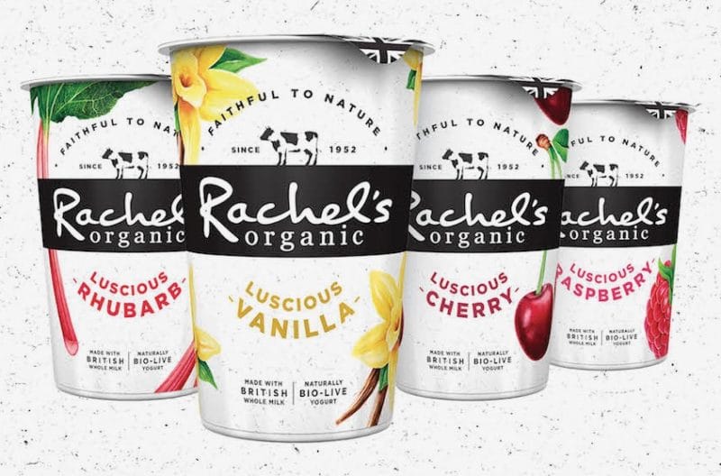 As part of the refresh, the brand is launching a new Luscious Big Pots range, consisting of four flavours: Vanilla, Raspberry, Rhubarb and Cherry. Inspired by the family recipes passed down for over half a century, the flavours are made with a thick textured yogurt made in the Welsh dairy with locally sourced organic milk and containing no artificial ingredients.
The rebrand will be supported with a £1 million above the line media campaign.


